Checkout Page Glamour
🛒 CLICK TO BUY FOR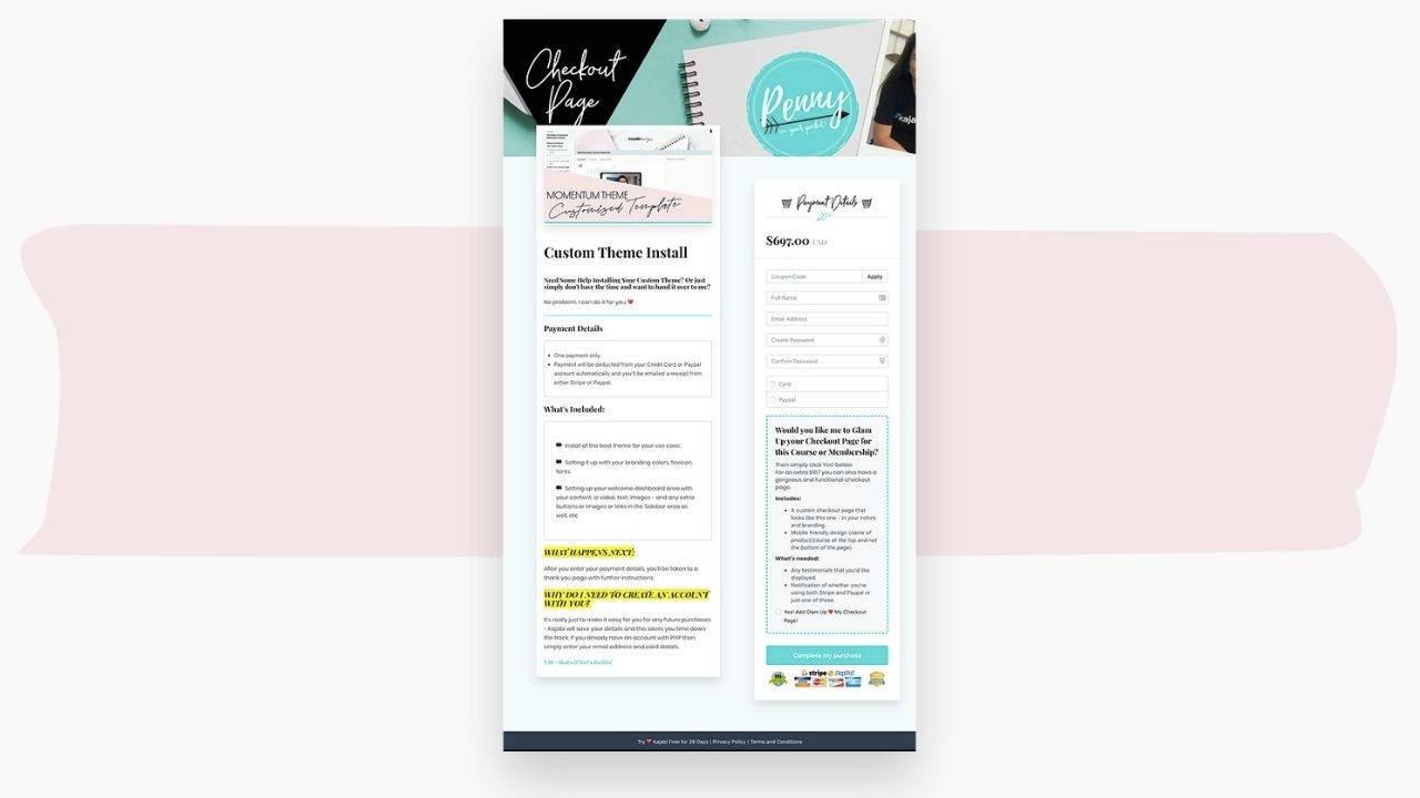
How To Glam Up Your Kajabi Checkout Page
Ok --> so you've seen what the typical Kajabi checkout page looks like... and you're like, wait - what? Is that it?
It looks pretty bland and you're worried that it's missing critical components for conversion.
Hmmm... well, imagine if you could not only make it look gorgeous, but ensure you have all the key 'conversion' areas on there?
I got you friend!!!
It's time to save yourself a stack of time (and possibly lost sales) and use some specially crafted 'secret sauce code' & styling tricks to get your checkout page rocking!!!
All my training videos are easy to follow -
you can do this all by yourself, so you can kick that Tech fear TO. THE. CURB!
All you need to do is:
- create your checkout page as normal (and I give you my top tips on what to include),
- change any colors or images (I give you suggestions, as well as graphics and images you can use - another BIG time saver!)
- apply the code to the areas you need it (decide whether you want to use the advanced code, or the simple code)
- ... and VOILA!
Your new Glammed Up Checkout Page is good to go.
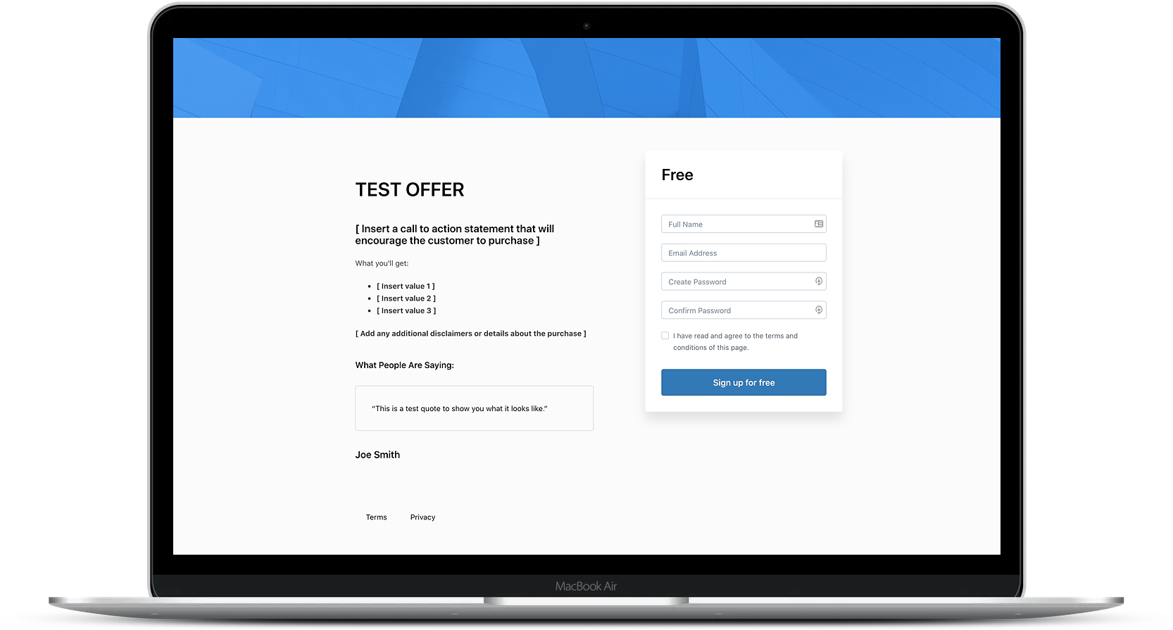
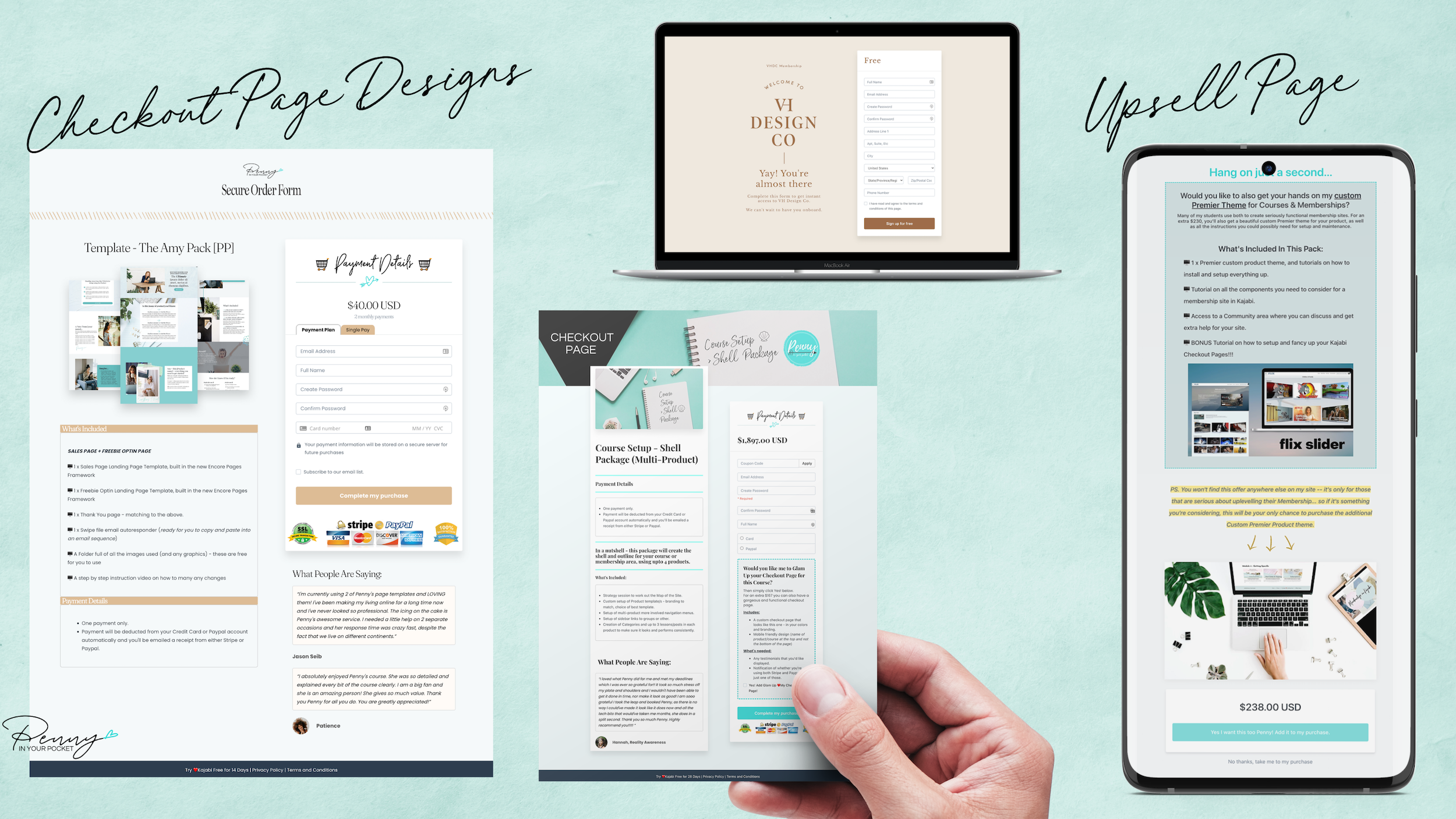
from this
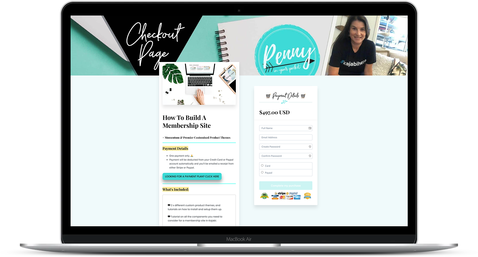
...to this

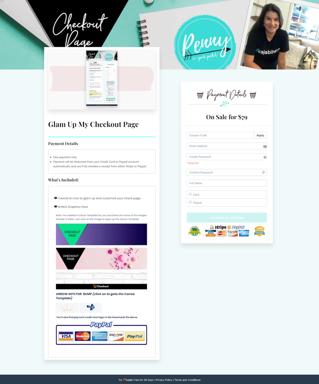


Frequently asked questions

What Will I Learn?
Do I Need to Access The Theme Code Editor
How Does It Work?
Is there a Guarantee?
Is it Easy to Use?
Where do you suggest to go for images, if I need them?

Have a question about this tutorial?
Ask away....

