Wondering How You Build A Membership Site In Kajabi?
You're not alone my friend.
To create a successful one, there's actually quite a bit involved. A lot will depend on your 'wishlist', the Kajabi plan you're on, the type of membership strategy you intend on running, whether all of the content you want to deliver can 'look' the same way and whether you plan on using your Kajabi site for JUST A MEMBERSHIP or selling separate courses as well.
This Instruction KIT (and the accompanying specially designed Membership templates) will teach you all you need to know on how to get the best out of the program -- and step by step how to create the membership site that's just right for you and your members.
READ ON TO FIND OUT HOWCustom Kajabi Product Themes
for Membership Areas

Get the "How-To" Tools You Need to Finally get Your Membership Site up & running using Kajabi!
So... you've made the decision to start a Membership site based on what you already know, love and do. YAY - that's awesome!
You may be a member of Stu McLaren's Tribe (if you're not - get over there now)... or you may follow other membership experts who've all talked about the much coveted, low-stress recurring income stream. Go you!
BUT.. now it's coming down to crunch time.
Now you want to know how to actually pull this off inside Kajabi? How do you make your members portal shine?
Is it even possible to create a Membership site in Kajabi (one that makes sense…. and isn’t just a course pretending to be a membership)?
So many questions...

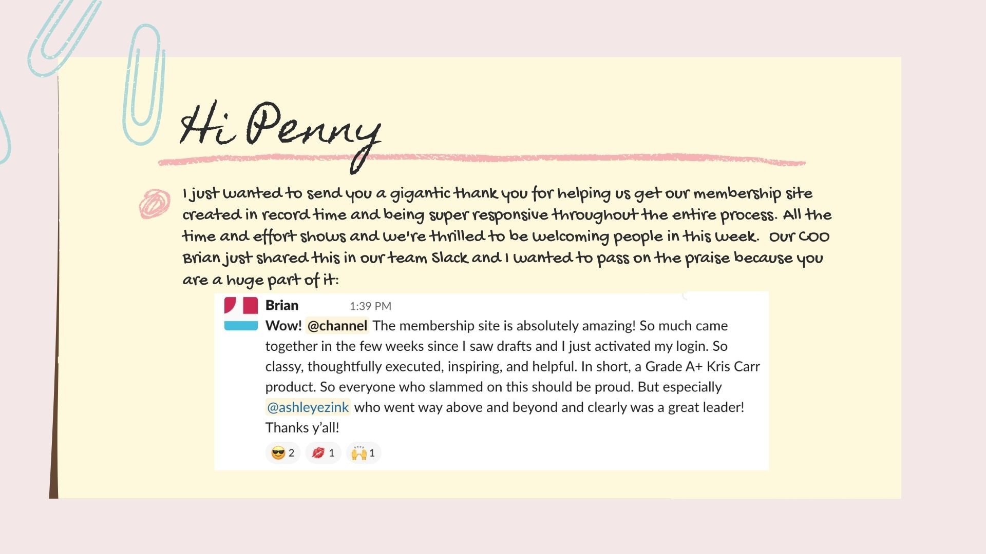
Funny…. these are the exact questions I had thrown at me in 2019 by the amazing Kris Carr team.
It was time to create their membership site and they’d heard so much about Kajabi they wanted to know what was possible…
The thing is...it wasn’t possible to create a membership site that looked like it was supposed to be one. We could use a product and create some categories and pretend it was a membership… but it still showed “Course Progress” elements, & other components that wouldn’t make sense to members. And then there was the navigation that left students confused and having to click a few times to find what they were looking for…
🤷🏻♀️ Hmmm and what about the look?
There was no way I could use a stock standard template and recreate Kris’s beautiful branding or style… (have you seen her gorgeous website?) so yeah, we were in a pickle…. This was going to be a custom job.
And so with my fingers crossed…. it began… the quest to find the perfect Membership Site solution.
After delving into the world of code and immersing myself in the psychology of how “members’ move around sites… we came up with the best solution.
It was a combination of ‘tweaked’ pages, products and a new library area…….
And it worked beautifully.
Kris had the perfect home for her members - both functional, beautiful and simple enough that her team could manage updates moving forward.
PS I highly recommend the membership if you’re into health and wellness!!!
But it left me wondering...
How could I recreate something similar for all Kajabians to use, without having to fork out the thousands of dollars for custom work…. Could we make this into a template for all to use? Could I make it simple enough that anyone can use it?
Well, in case you don’t know me…. I best let you in on a secret….
I’m a sucker for challenges.
You throw one at me and I’m compelled to take it up!!!
Challenge accepted my friend.
And VOILA -- a baby is born, not just the membership templates, but a course to go along with them. You can now have your very own gorgeous membership site, AS WELL AS the tips, tools & resources to hand it over to your VA to implement for you ---
or you can totally do it yourself ⤵

"How To Build A Membership Site" is a step by step Instruction Kit complete with 2 custom theme (template) designs.
STEP BY STEP VIDEO COACHING BY A KAJABI EXPERT
PLANNING & IDEAS FOR THE BEST NAVIGATION AND SETUP
DRAG & DROP CUSTOM THEMES - MAKE THEM YOUR OWN
Want a quick walkthrough of what it looks like?
Join me for a personalized message and look at what's inside the Instruction Kit and also how the custom themes can look....
PS. Ignore the mix up of words...(can you spot them?) I think my brain was so excited to get this to you my mouth couldn't keep up!!! 🤣
How many hours will you spend looking at help files and asking questions in groups on the best way to setup your membership using Kajabi?
I think you'll find it might be a lot. Surely you want to save all that time and hassle, get your site built and launched, your members settled in a beautiful online portal, and of course --- watch your bank account start to increase?
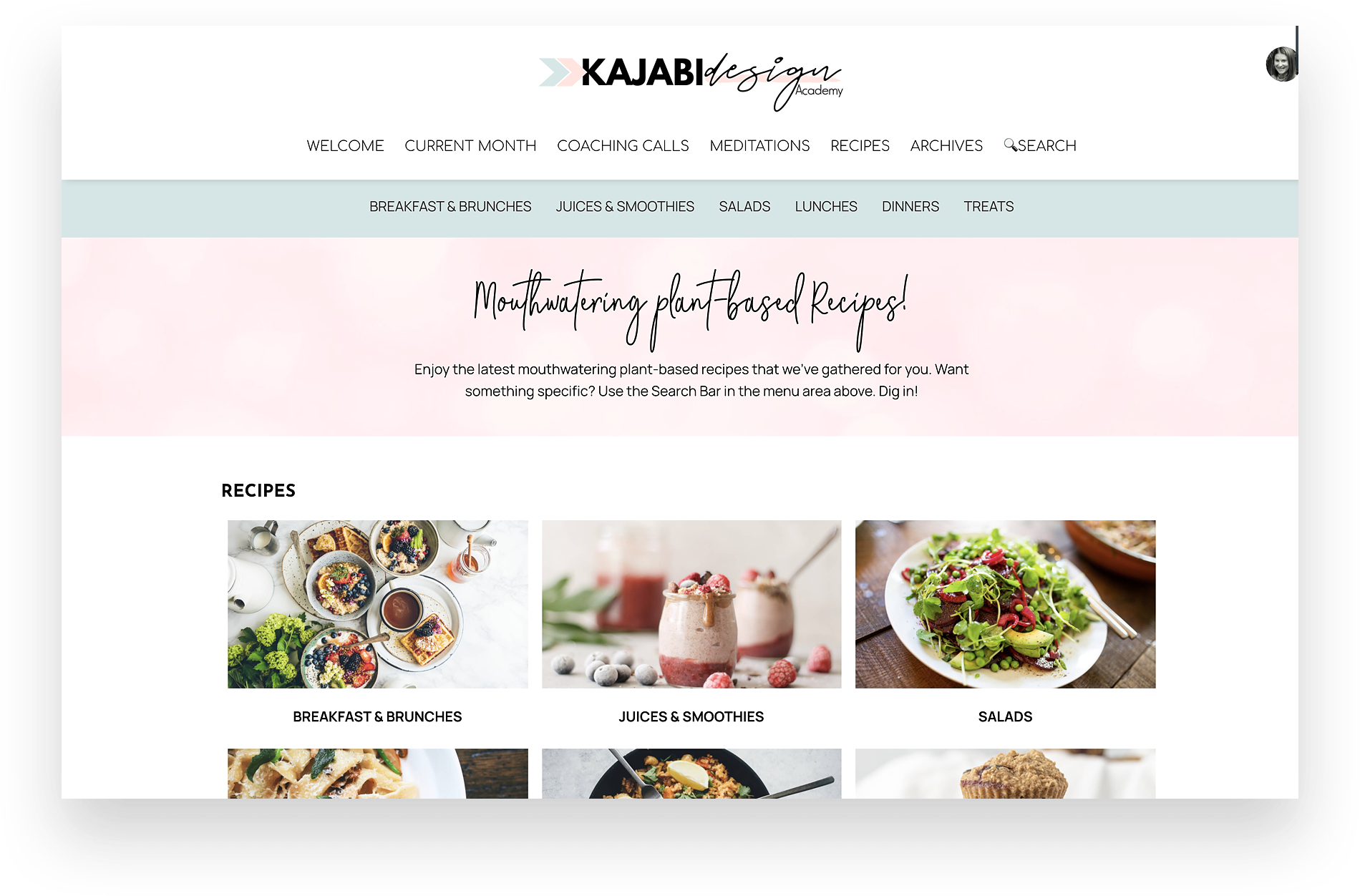
Ever wondered how you might be able to tweak Kajabi and make a cool Recipe Library -- or a Fitness Video Library?
Me too!!! So I got to work on making this happen -- and now I can share it with you. So cool, it can even have another level of menus so you can really deep dive with your categories... and it showcases your content in a much more user friendly way. We get specific and cover this plus Start Dates, Dripping Content & Subscriptions.
What about if you need extra help?
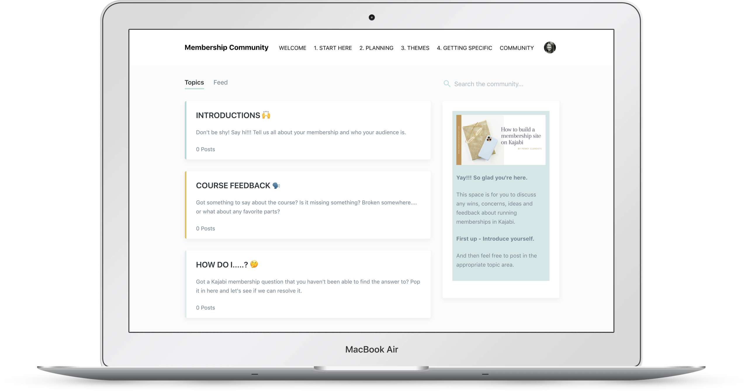
Yay - I've got your back. In the true spirit of embracing Kajabi all-in, I thought it would be fun for us to give the Community Product a spin... This can also be a good test for your own Community - you'll get to see first hand if you like it or not!!! All questions around the course and the themes will be answered in here.

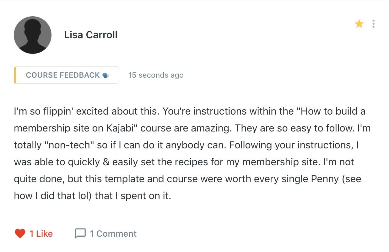


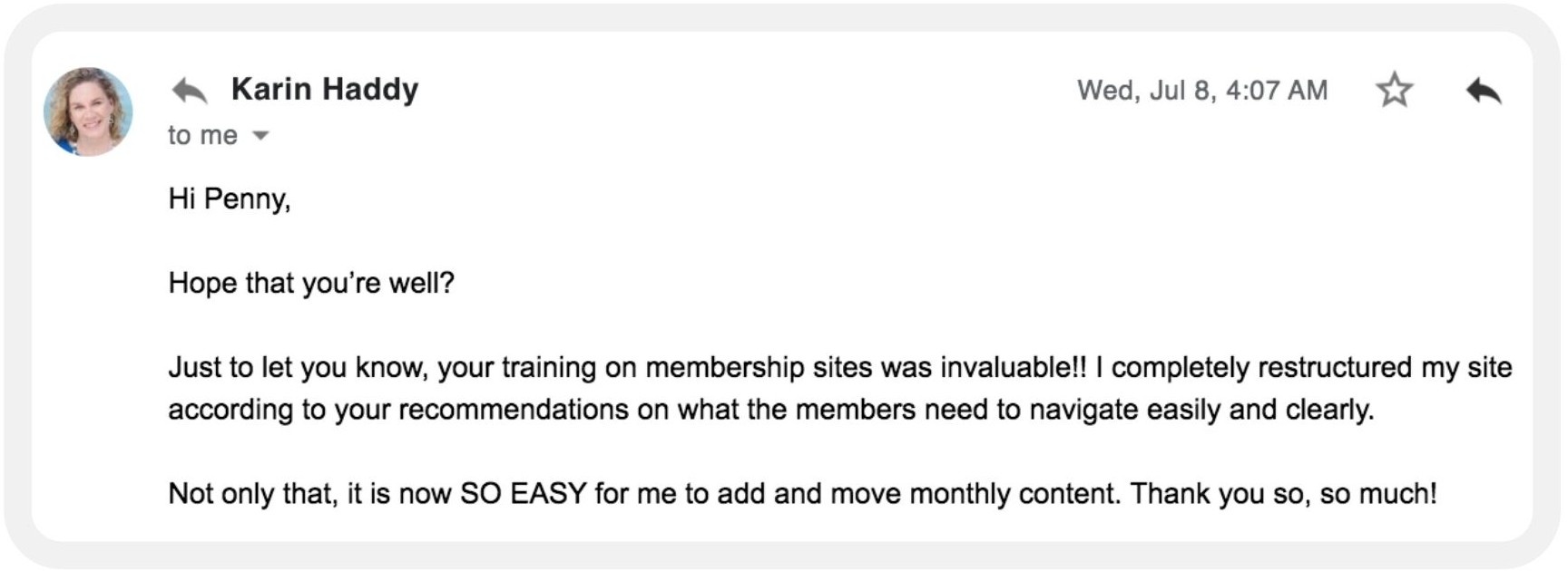
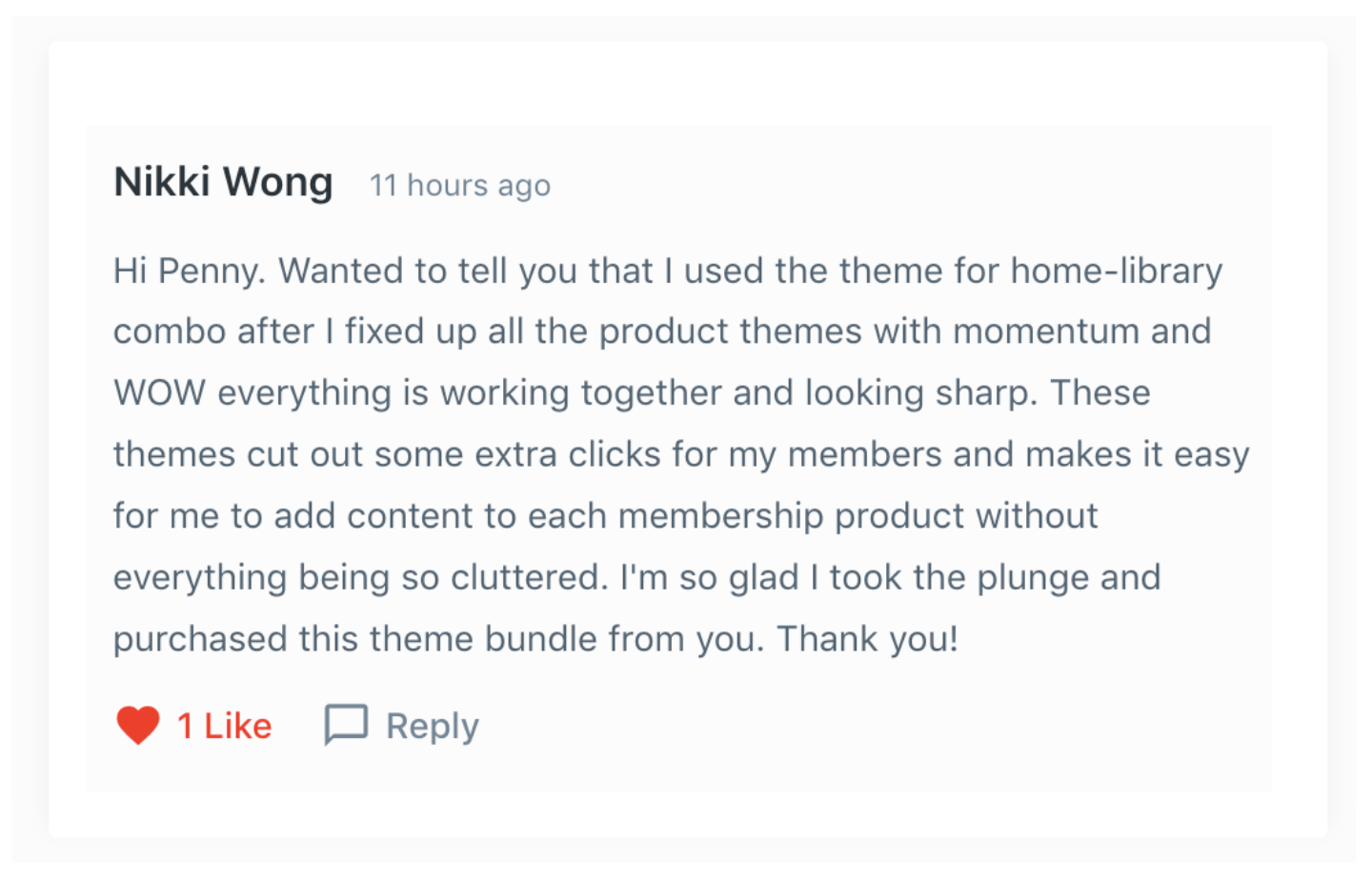

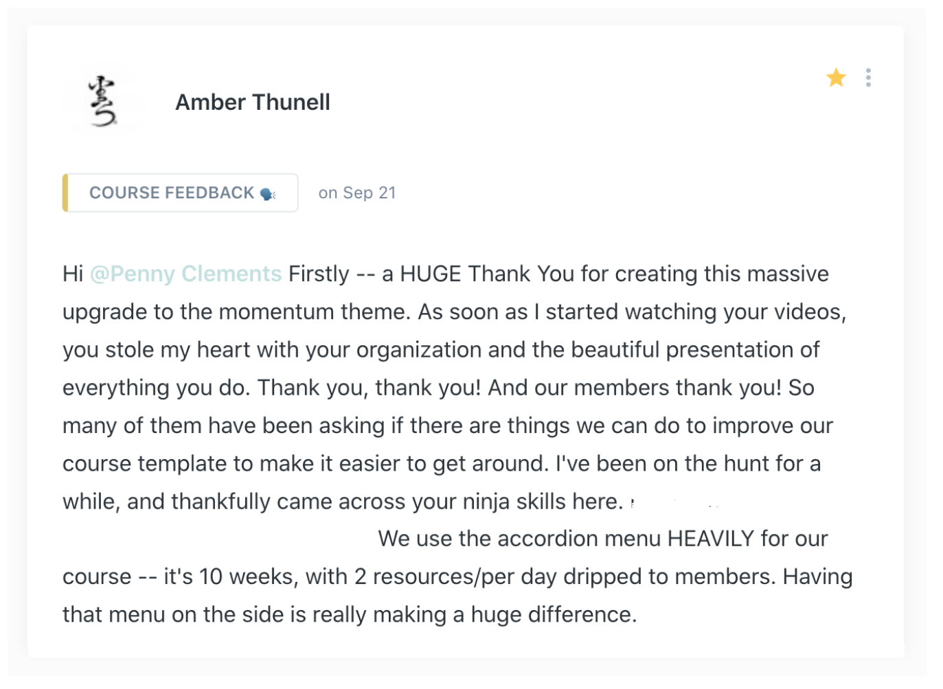

Introducing...
"How To Build A Membership Site On Kajabi"
A complete "how-to" instruction kit with strategy and templates that will take your Kajabi site from plain to gorgeous in a weekend.
The perfect solution for course creators and membership site owners looking to showcase recipes, fitness videos, monthly coaching calls, Q&A’s, meditations, and a whole lot more.

You'll Learn How To:
- Design a membership area that your members will love being in (the look and feel of your members area can make a huge difference to customer retention and premium pricing)
- Resolve the navigation issues of Kajabi themes (no more constant clicking and getting lost for your members)
- Enhance the look and feel of your site to match your branding (give your site the ‘wow’ look and make it unique to you)
- Transform your one product membership site to a multiple product membership area without creating confusion for your members. (Yes, it’s possible and even preferable to use more than one product - you’ll learn why)
- Integrate different themes for different products and yet keep the whole portal feeling and looking the same. (Because sometimes not all categories should look the same)
What’s Inside
“How To Build A Membership Site On Kajabi”
PART ONE: YOUR VERY OWN BESPOKE PRODUCT TEMPLATES
Custom Premier and Momentum Product Themes (Value $797)
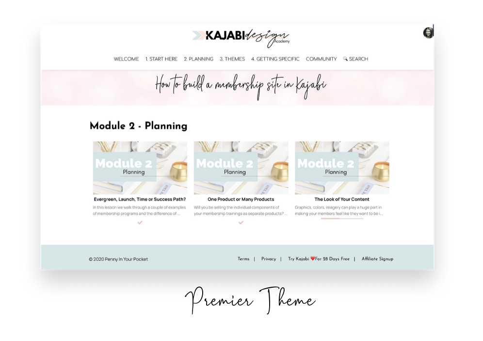
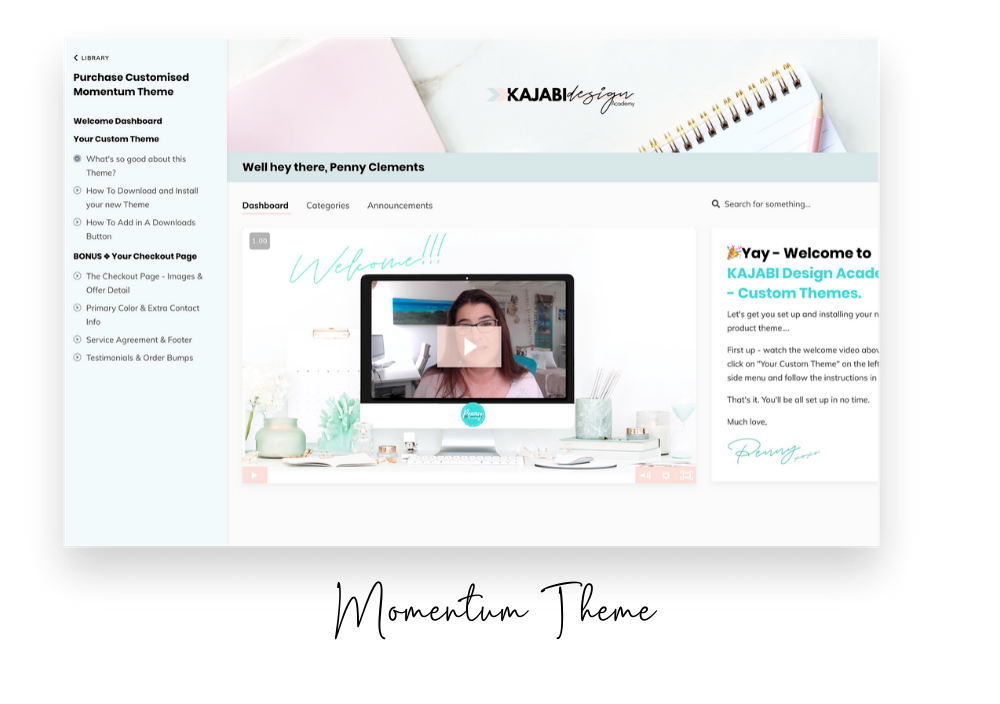
Imagine having your membership site or course area mapped out and built in a weekend - not weeks, with the ability to custom design it yourself?
You’ll never have the “how do I add images or videos to the welcome body area” thought again as you follow along the setup tutorials and suggestions on what to put where.
- Comes with two custom designs (you choose the one you want - or use both depending on your setup - and you can now choose from all of my custom Momentum themes well!)
- You have the ability to add in extra Google or Adobe fonts to better match your branding - plus the option to use a third font for your H1 Headings. Note: if you have access to your Code Editor area you can also use Custom Purchased Fonts.
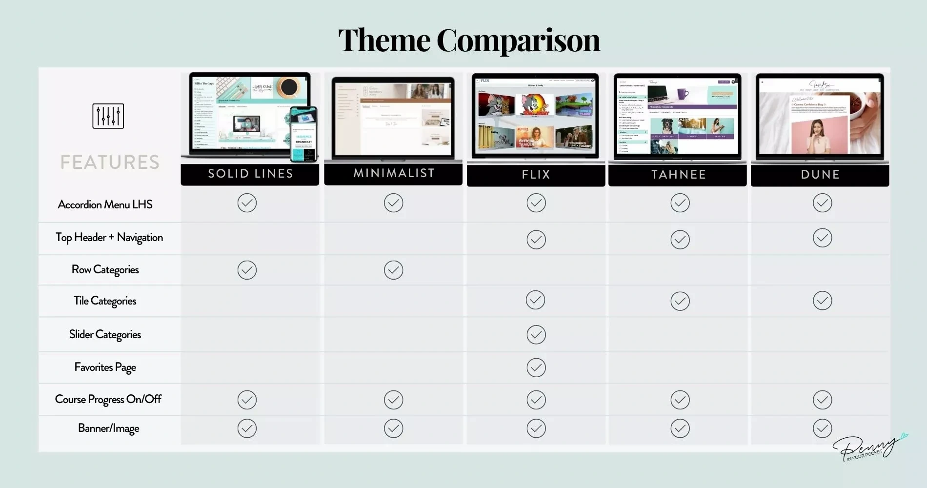
- The Premier theme has an extra special layer of navigation. The ability to have the template look more like a website with horizontal menus, and you can have a secondary navigation menu appear as well.
- The Premier theme shows 3 x “Cards” in a row for categories, subcategories and posts - instead of one small thumbnail with some text shown in rows.
- The Momentum theme allows you to have a banner image, an accordion style dropdown menu, and the ability to remove all references to ‘course progress’
PART TWO: YOUR STEP BY STEP TUTORIALS
Strategy and How-To Videos on all the things you need for a Membership Site built in Kajabi
How To Build a membership Site In Kajabi is broken up into 4 areas, Strategy, Planning, Themes & Getting Specific. The most important part of your membership site is in your planning - which is why it’s crucial to get this right.
HERE'S WHAT WE COVER...

Module 1: Strategy
We’ll look at the strategies most membership site owners utilize and how they might look on Kajabi.
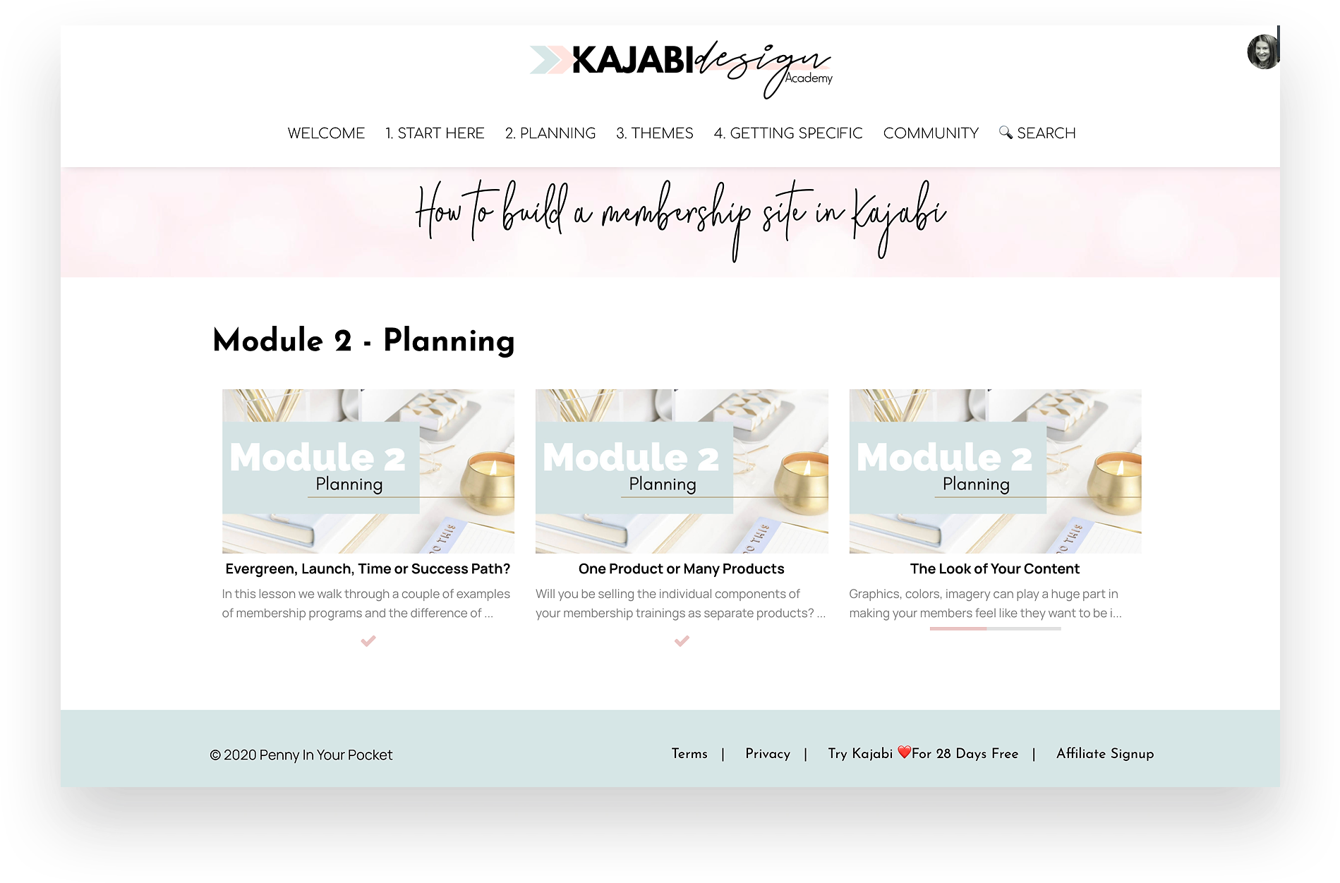
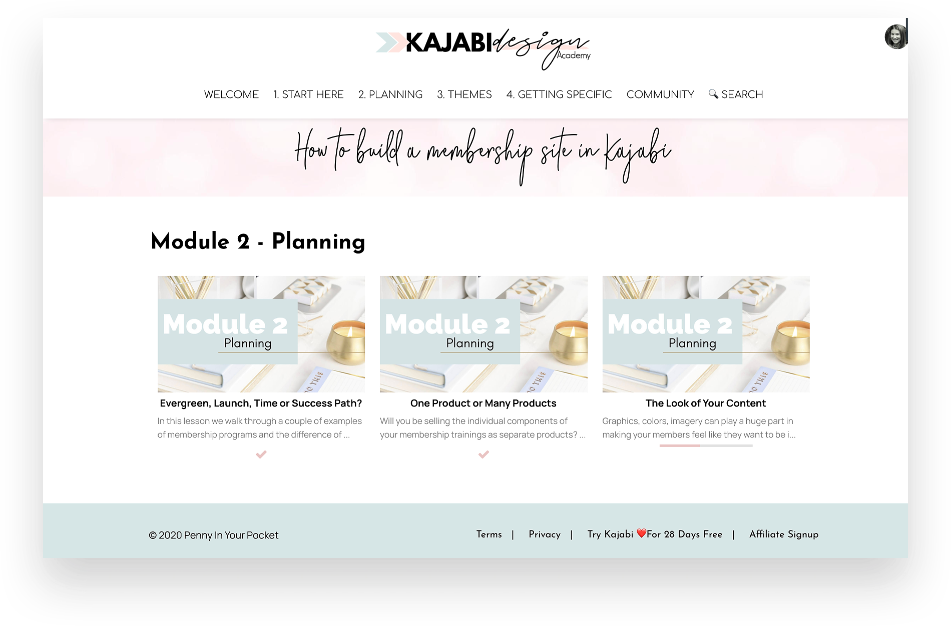
Module 2: Planning
In this module we unpack the differences between Evergreen, Launches, Success Paths, Time-Based memberships….. Why you might choose one over the other, suggestions on categories and how to handle these… as well as whether you need to use only one product on Kajabi or multiple.
Module 3: Themes
Learn how to use the custom themes, make them look amazing, and ensure you have the navigation menus for your site downpat and easy to use. We want it to appear seamless for your users!!!
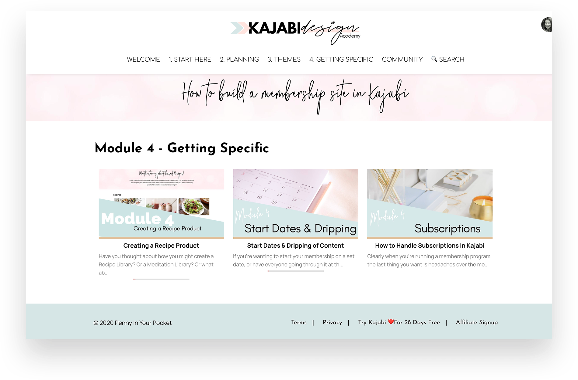
Module 4: Getting Specific
Ever thought about how you do a Recipe Library or a Fitness Video Library on Kajabi -- well in this module we take a deep dive into how, as well as looking at Start Dates, Dripping Content and Handling Subscriptions.

✧ PLUS ✧
I’m Going To Add In Some Extras To Ensure You Can Create Your Membership Site With Ease & Flair.
✨ BONUS #1
- Kajabi Poster Images
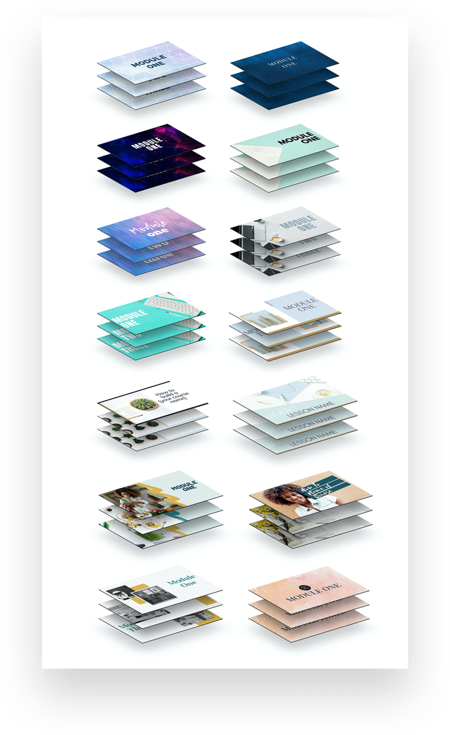
Want to save yourself some time and get your hands on 14 x Sets of Canva Poster Images? These are now included as well! They are preset to the correct size for Kajabi Poster and Course Images... all you need to do is pick the style you like, change any text, and any images... and install them into your Product area!!!
Each set includes the following:
- 1 x Course Poster Image
- 5 x Module/Category Poster Image
- 1 x Current Month Poster Image
- 1 x Archives Poster Image

✨ BONUS #2
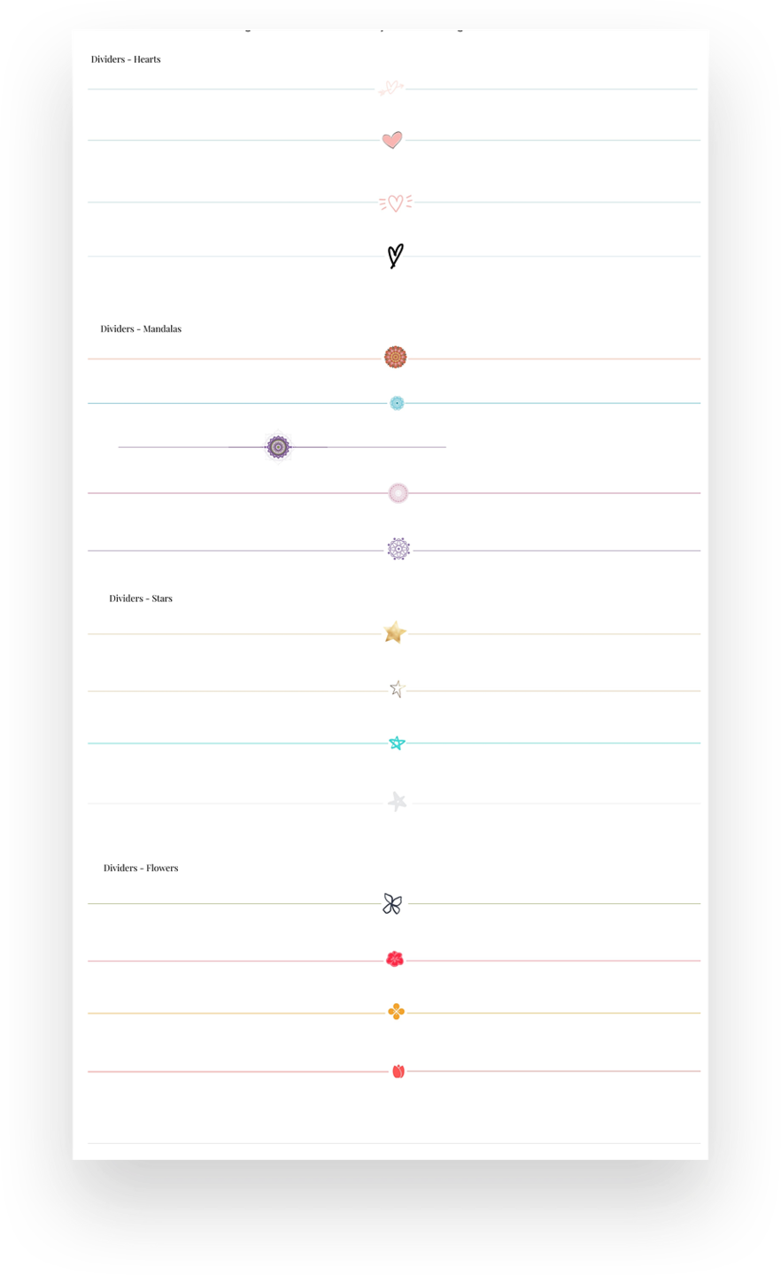
- EXTRA GRAPHICS - Set of Dividers
Let’s face it -- it’s hard finding time to create graphics, and if you don’t have time (or the know-how) then there’s also the cost of paying graphic designers to make these for you. Pick the divider you like, change any colors... and install them into your Product areas!!!
Includes the following:
- 17 x Various Styled Dividers. A style to suit most sites, choose from hearts, stars, flowers, mandalas.
✨ BONUS #3
- HOW TO MAKE YOUR DOWNLOADS STAND OUT IN THE MOMENTUM THEME
If you’re familiar with the Momentum theme already, you’d be aware that the Downloads section is pretty boring and can easily be missed by your users. Learn how to make this stand out with custom designed buttons - comes with some graphics you can use straight away.
![]()
✨ BONUS #4
- How To Glam Up Your KAJABI CHECKOUT Page (Value $97)
Let’s face it… one of the most important pages in your sales funnel is your checkout or order page - so why not give it the best possible chance of converting. We’ll show you how to make this page shine and by changing up just 5 items help you increase those conversions!
Training includes the following:
- CSS Styling Tricks
- Custom Code (Advanced Users)
- The 5 key things you must be doing on this page
✨ BONUS #5
- COMMUNITY (Value $297)
Sometimes we all need a bit of accountability or help with a question… and that’s what our Private Community area for Kajabi Membership owners is all about. Meet fellow membership creators and get ideas on how they’re handling aspects of their own business, learn extra tweaks you can do with Kajabi, share your wins and learn from others. You’d be surprised at the varied group of industries and individuals we have in there.

1. CUSTOM PRODUCT THEMES
2. STEP BY STEP TUTORIALS
3. BONUS! KAJABI POSTER IMAGES
4. BONUS! SET OF DIVIDERS
5. BONUS! HOW TO MAKE YOUR DOWNLOADS STAND OUT
6. BONUS! HOW TO GLAM UP YOUR KAJABI CHECKOUT PAGE
7. BONUS! COMMUNITY
Total Value = $Priceless

New
Pick your choice of custom Momentum Themes!
Yep... that's right you can now pick which custom momentum theme is going to be the most suitable for your membership!
This is included as well as the original custom Premier theme.
It's time to make your members area dazzle.
Looking forward to having you onboard and seeing your site come to life.
BUT DON'T WORRY
You won't be paying the Bespoke Custom prices of over $2500.
You can now do this yourself for the DIY price of $497.
Frequently Asked Questions
Can I Buy The Themes By Themselves?
Is there a Payment Plan?
Do I need a Kajabi Account?
Refund Policy
Do I have to use these colors?
Can I Demo the Themes first?
Is this course for 'Kajabi Newbies'?

Who is this
Penny
chick?
The Chit Chat Version: A mom, nature lover, entrepreneur [just like you]..., a computer geek, an avid learner, a creative, a master number (according to numerologists??? 🤔), someone who loves to travel (when she's allowed to!!!) and someone who loves meeting people from all walks of life!!
The "As Professional As I Get" Version: Penny Clements has been designing, creating, selling and using Kajabi since 2015 and was an early adopter of the platform when it relaunched. Having worked with various big names in the online industry, and helping them move to Kajabi, she has well and truly earned her stripes and understands this program better than most. But she’s also a creative and software ‘tinkerer’ from way back -- it was inevitable she would power up her keyboard and take Kajabi to another level.
